
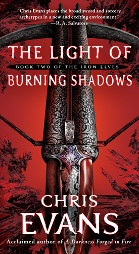
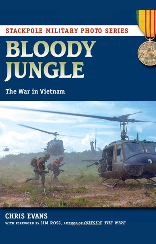
If I knew how to dance, I’d be doing it right now. If you click on this Amazon link http://www.amazon.com/Light-Burning-Shadows-Book-Elves/dp/1416570535/ref=sr_1_1?ie=UTF8&s=books&qid=1242081459&sr=1-1 you’ll be able to zoom it and see it larger. I’m thrilled with how it turned out. The artist this time was Alan Dingman. I’m officially a huge fan.
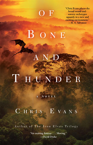
First sample of Of Bone And Thunder! Here’s the prologue and map
PROLOGUE: A BLACK CONDOR DIPPED her featherless head and flapped her wings, straining for height. Another vulture drifted in front of her, forcing the condor to climb higher in the crowded wheel of circling birds. The condor struggled, her body weak from having little to eat over the past month. The sun had yet to… Read more »
That looks great!
Thanks. They style is the same, but the use of red this time gives the book a wholly different feel than the first one.
Nice! now, just for the words that go into the pages that cover is around… 🙂
Just as soon as I finish writing it…Actually, the files will be going to the printer here in the US later this month so everything is on track. I think the UK edition which is what gets shipped to Oz/NZ goes on sale early August, but don’t hold me to that just yet.
That looks great! It’s really an attention-grabbing cover, isn’t it? I think so at any rate. 🙂 I’m now looking forward to the book even more.
I think so, too, thanks. We worked a couple of different treatments for it, and I’m thrilled with how it turned out. Oh, and when I say we, I mean I made comments and the professionals nodded politely and created something much, much nicer.
Great color, neat design! Can’t wait until it’s out!
I know, the red just screams “stop and look at me”. And I love the way the artist interpreted Yimt’s shatterbow. Better than I ever imagined it would be.
That’s gorgeous!
I happily second that notion, thanks 🙂
The cover gods have smiled on you yet again, Chris. It’s beautiful. *sigh* Love the bow (and its detail) and the red…
I do feel extremely fortunate. Speaking of covers, how is yours progressing? When’s the big unveiling?
Not too much longer. Possibly by the end of the month, or so I hear… 😀
This is so detailed. You have to admire anyone who wnet into such details. You have to zoom into it to see the tiny little details that seem hardly possible.
This is great and I can not wait for the realease. This is the main reason I look forward for the summer other than the realease from the hell that is school only for me to realize that school is heaven compared to paying taxes.
There is one thing that I have against this though. The first book’s cover had fire on it that went with the title but here I do not see any light or shadows but other than that it is…spectacular. I would say awesome but I am trying to reduce my use of awesome or risk verbal inflation.
Rock ON!, Matthew.
The detail really is exceptional, thanks. I especially like the wood grain. And the way the star motif was picked up from the sword to the shatterbow.
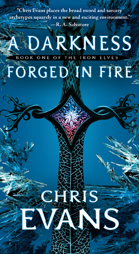
You’re correct, the cover is a bit more atmospheric, and less literal in its approach (although the sword on the cover of Darkness was not literal but rather a symbolic representation of several elements within the novel). The key with any cover, I think, is does it grab your eye enough to walk over and pick it up? Judging from mine, yours, and others opinions I’d say this one fits the bill. After that it’s up to the story.
beautiful
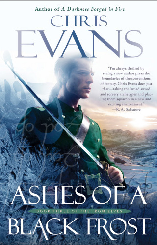
Love the way it repeats the black frost theme, too. Just gorgeous. I have it on pre-order already 😀
Re: beautiful
Very nice to hear, thanks. I love the frost, too.